Camilo Lab | Website design + brand strategy
The Project:
Client:
The Camilo Lab is an ecological research group primed for public engagement. They focus on native bees in the urban environment, how declining rust-belt cities can act as refugia for pollinator species, and what we can do to help native pollinators thrive in urban, suburban, and agricultural spaces. Yet the Camilo Lab had no website (!), no database of its amazing activities, no way to engage with the work or the scientists online. We needed to get this lab online in a big way, to expand the impacts of their important work on native pollinators.
Goals:
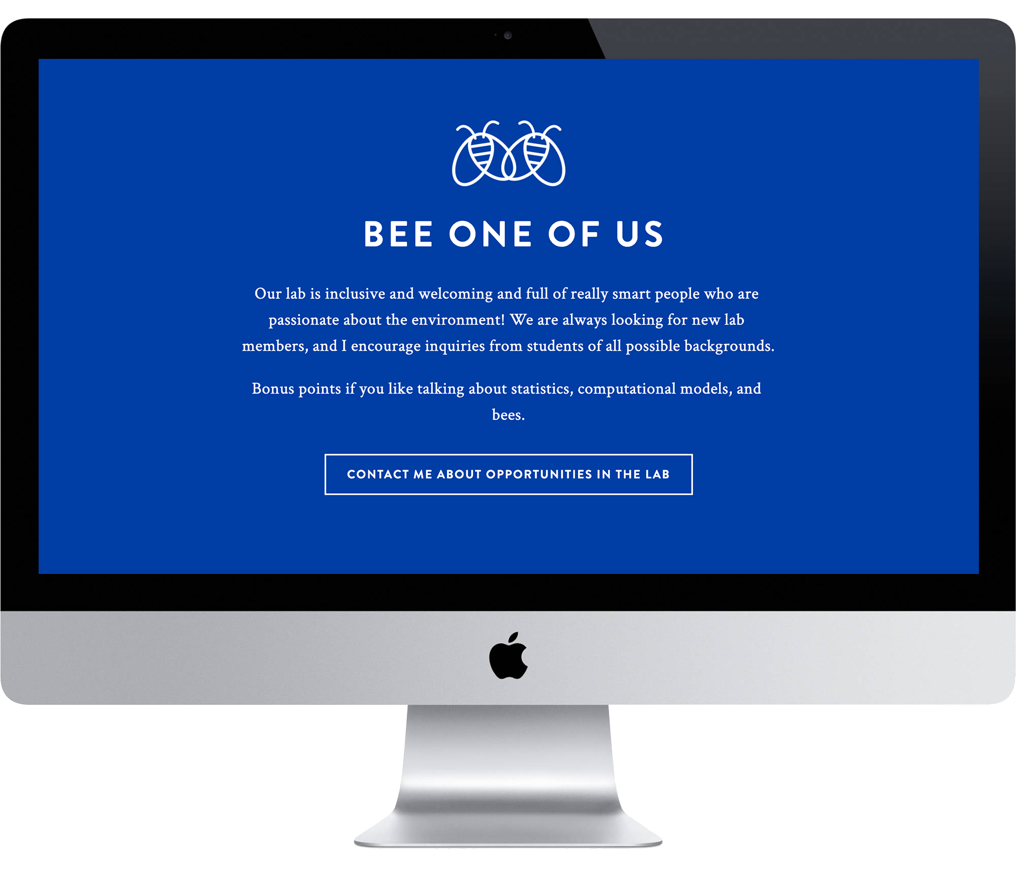
Build a compelling brand and gorgeous website that does this research justice. We wanted a brand that reflects the playful personality of the PI and his sheer love for science, bees, and people. We wanted to help the public meet their native pollinators and discover the opportunities that urban and suburban spaces offer. Some of the features of the website include a Latest News blog, integration with the departmental Twitter account and Instagram, and interactive project pages that focus on major takeaways and action items from the research.
our approach
We wanted a playful look that both paired with the University and stood out on its own. We emphasized the most iconic color of the Saint Louis University palette - SLU blue, as it’s known. We kept the look clean and accessible, with whimsical visual elements like bees, hives, and flowers woven throughout the site.
the brand
playful, professional, productive
We didn’t want to swing too far into whimsical and playful content. This is a serious lab doing important work, but with childlike awe for the power of science and the beauty of natural systems. Thus, we balanced playful graphics with professional content that highlights the productivity of the lab and their commitment to diversity in science.


